Sea Quest Kayaking
User Centered Web Design
Project Type
Academic
Duration
Mar - May, 2021
Team
Team of 5
My Role
UX Research, UX Design, UI Design, Information Architecture, Usability Testing, Hi-Fi Prototyping.
Overview
Sea Quest Kayaking is a local Seattle organization that has been providing kayak guides for over 30 years.
The project aims to provide Sea Quest Expeditions the opportunity to engage in a process of redesigning their web applications with a User Centered approach. The main goal of the redesign is to increase the customer conversion rate as well as the brand reputation and awareness through improving the customer experience.
Study Plan
The team conducted a variety of user research and usability testing, to assess the status of Sea Quest Kayaking’s current website to guide the project.
To follow are key examples that use the Nielsen Norman Group 10 Usability Heuristic for User Interface Design to frame the assessment.
Heuristic Evaluation
To assess our client’s existing website, we worked through a Heuristic Assessment, using the Nielsen Norman Group’s 10 Usability Heuristics. This helped us get on the same page and use a common language to discuss the current status of the website. Following are some key highlights from our assessments.
Aesthetic and Minimalist Design
The current organization and amount of content leads to overwhelming the user. Additionally, this affects the usability of the UI and the Information Architecture.


Consistency and Standards
The user interface and interaction has elements that doesn’t match the users expectation and previous experience.This includes elements that look like buttons and static carrot symbols.
It is not clear what the three yellow elements are. The description does not explain the purpose of the part and makes the reservations flow complicated to initiate.
User Control and Freedom
The website contains interactions and elements that situates users to question their decisions and awareness of the process. This includes instances where specific language is introduced during a user flow and perception of decisions being made.
As the user inputs data, the response with defaulted check marks and redundant results can cause confusion.

Objectives
Business Goals
We conducted multiple interviews and engaged in conversations with our client to understand the business model and functioning and future prospects for his brand. This research in partnership with our client helped us arrive at a few business goals for the redesigned website, they are:
Increase in Booking Conversion Rate
25%
Decrease in
Bounce Rate
25%
Reduction in
Booking Time
50%
Design Rationale
Based on insights from heuristic evaluation and usability testing of the current website, we arrived at a design rationale for our website redesign, they are:


Decrease
Irrelevant Text
Update
Imagery
Improve Informtation Architecture
Improve Site's
Visual System
Remove
Broken Links
User Research
For our research, we used user reviews from various websites like trip advisor as well as google analytics as Tools to gather data. We also performed Usability tests and Focus groups as methods to conduct research.
Here we have some key insights from each of our preliminary user research methods that drove our initial design decisions:
Focus Groups
“Felt like if you didn’t already know what you were looking for, you’d look over it and move on.”
User Reviews
83% of reviews that mentioned the website expressed feelings of being mislead by the website’s whale encounter images and statistics.

Google Analytics
59.2% bounce rate.
82.8% of visitors were new
92.6% revenue came from returning visitors

Usability Tests
Most of our test participants felt that the web pages were very long and information dense. They were confused about navigation menus, tour structures and were unsure of where to click.
Primary Persona
Our primary persona was created based on demographic information received from stakeholder meetings and site interaction data from Google Analytics.

Leann Grey
Age 52 - Business Admin
Technical - Mainly Laptop
Stakeholder insights
60% of reservations are made by females
-
Particularly in their 50’s or so
-
Booking trips for their families
Middle to upper-middle-class people
Educated with college degrees
50% of customers are first-time kayakers
Users are interested in shorter trips
Card Sorting
The team conducted card sorting exercise with 10 participants.
30% of participants created
8 main categories
- Kayak Tours
- Kayak Rentals
- About Sea Quest
- Reserve
- FAQ
- Reviews
- Whales
- Other Info

Information Architecture
Our card sort results allowed us to focus navigation within our information architecture.

.jpg)
- Decreased the main menu items from seven to six.
- Removed “Reservations” in favor of a “Book Now” button.
- Removed left sub menus
Lo-Fi Prototype
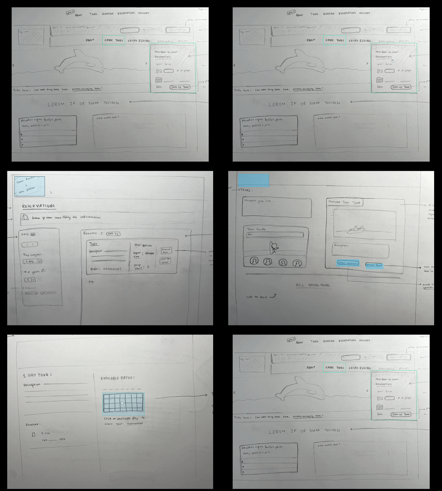
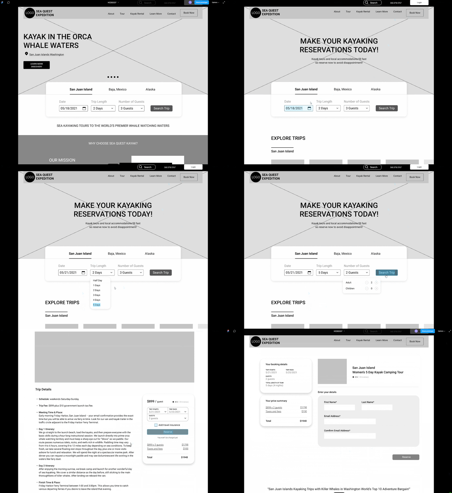
The team created low and mid fidelity prototypes to get insights from usability tests early in the design process.

Sketching and Paper Prototyping
Focus varied on interaction design, content organization, and visual design between the paper prototypes. We reviewed the strengths and weaknesses and carried over to the mid-fidelity prototypes.
Mid Fidelity Prototype
With the mid fidelity prototype, the team wanted to test tasks and scenarios like
- Booking single day and multi day trips for variety of group sizes.
- Searching for relevant information, such as COVID and custom Tours

Key Insights
We performed usability tests with 5 participants and the insights were used to elevate the design rationale and decisions of the high-fidelity prototype
“I need to see the prices of tours on the cards up front”
“I dont read long discriptions about the company and their marketing material”
“I am not able to understand if im in the shopping cart page yet”
“The top menus are easy to understand”
“I trust user reviews to get information about the quality of a tour”
“The use of high quality pictures and icons elevate the overall experience”
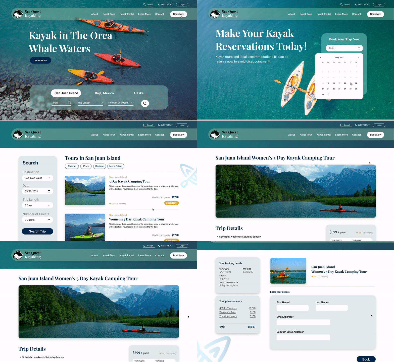
Building up through all the user research, personas, wire-framing, and usability tests, we arrived at our final high fidelity prototype! We have redesigned 17 pages and subpages in total and most importantly, we’ve streamlined the booking process to achieve our client's goal for this redesign.
Hi-Fi Prototype

Style Guide
Brainstorming with our client, we came up with four main brand tenets that we wanted the redesign to reflect.
Expertise and Professionalism
Fun and Exciting
Educational Journey
Accountability

Colors
Sea Quest Kayak is one of the oldest and most professional kayak tours provider in the Pasific North West and has been in the market for more than 30 years, we chose the dark navy blue color as the primary color to emphasize their expertise and accountability. The Yellow color for the primary functions imitates the bright colors of kayaks in the sea and adds to the fun nature of the tours.
Typography
We chose Playfair Display as the primary and header’s font. Playfair Display is a classic-looking serif font, it takes some cues from old world fonts like Garmond and Times New Roman, giving a timeless and mature vibe matching our brand tenets. It also compliments the sans-serif fonts like the Roboto which we chose as our body fonts.

Components
Here you can see some of the icons and button designs, and some layouts, all of them are with rounded corners, and drop shadow effects, so all the components look like floating on the page.
Logo Design
The current logo has been redesigned to a more recognizable minimalist design. Brainstorming with the client, we came to a conclusion to rebrand the business to 'Sea Quest Kayaking' as the word 'Expeditions' was perceived as overwhelming to the clients who wanted a fun and enjoyable experience.


Current Website
The images of kayaks and orcas are great, but the call to actions are not obvious enough. We want to let people know where to start to book their trip as soon as they get on the website. As for the booking process, you can see the current main booking page is lacking an obvious call to action button, and the large amount of text is a little bit overwhelming as well. After clicking into the page, you’ll see on the right hand side, the long list of trips may be confusing, since a lot of the trip names look very similar.


Redesigned Website
Home Page
We added a trip search widget on the home page and a “book now” call to action button on the navigation menu to highlight the main function of the website. The items in the navigation menu have been reorganized into 5 instead of 7. We’ve made use of interactive carousels to keep the cognitive load to a minimum.


Booking Page
The users have a choice to search the tours by either clicking the book now button and going into the main booking page or directly use the search tour widget on the landing page to search for tours. After entering the requirements, the system will show the users all the tours that meet their needs, you can click into the page to see the trip details and add travel insurance with the check box, and after entering some information, you can successfully book the trip.


Tours Page
with different simplified layouts, imagery, and text copy, users can easily find the information they need. Call to action buttons are embedded at important landmarks on the page to increasing the booking conversion rate.


Learn More Page
The focus was on simplifying the information layout and density of the pages and classifying large chunks of information into smaller groups. These small changes lead to simpler web pages that are easy to navigate and find useful information.


Other Pages
Our aim here was to simplify the information on the page allowing the user to find all the necessary information easily. We decided to combine the User and Media reviews into one page, highlighting only the important reviews.


Figma Prototype
Final high-fidelity prototype interactive prototype in figma.
Reflections
Obstacles
Our redesign occurred during peak kayaking season which created additional challenges related to meeting with stakeholders, deploying our survey to their customer database and receiving feedback on final design decisions.
Lessons
We would have attempted to get our survey deployed early in the user research stage. We also would also have liked to have begun the design process at an earlier stage in order to explore this project from a design POV and have multiple iterations.


